The psychology behind brand colors
The psychology of colors in logos and other corporate design elements is a science in itself. The brand image is a powerful tool, one that allows a company to put its values and ways of working in the right light.
Just look at the app icons on your phone, which color do most brands use?
When social media platforms came into existence, „all of them“ had blue logos and brand colors, with very few exceptions. Blue is the color of transparency and trust in many cultures. By using the color blue, the brands signaled to their users that they are open and inclusive.
As social media companies became more mature, a small transition has started to occur, but most have remained in the blue/lilac-tone areas. Just have a look at the colors of Facebook, Twitter and Instagram.
GANDT colors reflect our values
For our brand colors at GANDT, we decided to opt for a combination of greens and blues, too. Not just because we like the colors, but they represent what we stand for best.
As a Marketing consultancy, we live by four strong brand values that make us who we are: Sincerity, Curiosity, Personality and Mastery. We want our colors to reflect these values in the best possible way. Hence, we decided to stay in the Blue and Green color spectrum that reflects this best.
Learn from Fortune 500 companies
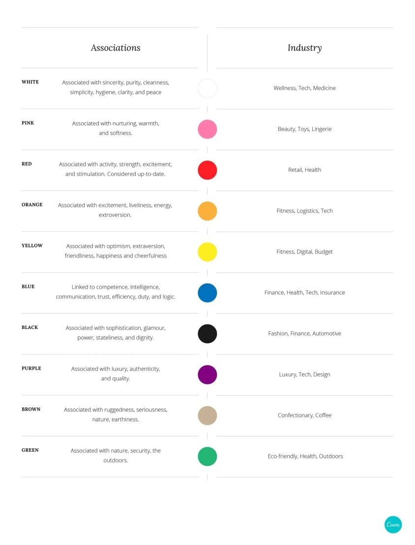
I just came across this Canva article on the psychology of logo colors, a nice and well balanced article that is certainly worth a few minutes of your time. When we go into the design and development stages for new venturing projects, color science is always a part of the design process. If you are unfamiliar with color science, a bit of research certainly cannot hurt.
Have a look at how all Fortune 500 companies use colors in their logos to portrait a certain image.
https://www.canva.com/learn/color-psychology-the-logo-color-tricks-used-by-top-companies/